
Monochromatic Colour Harmonies in Interior Design
What Does Monochomatic Mean?
The word monochrome, and its adjective, monochromatic, are fancy words used in everyday language, but have you ever given any thought to their origin?
Well folks, we have the gorgeous Greeks to thank, again! As with the word achromatic, monochrome and monochromatic descend directly from the Greek words ‘mono’ and ‘khrōma’, meaning one, and colour, respectively.
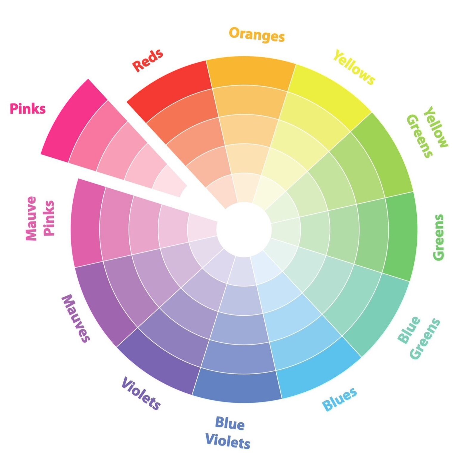
As with its Greek origins, the scientific definition of monochromatic refers to something that consists of a single wavelength of light or radiation. In interior design, we apply these definitions to create monochromatic colour schemes using a single colour hue. Varying colour gradients are achieved by adding whites, greys and blacks to lighten, mute and darken the selected colour. In doing so, several colour combinations can be created from a single colour.
What Is the Difference Between an Achromatic and a Monochomatic Colour Scheme?
Quite often, monochromatic colour harmonies and achromatic colour harmonies are misunderstood as being one and the same. However, monochromatic colour harmonies should not to be confused with achromatic colour harmonies. So, what is the fundamental difference between monochromatic and achromatic colour schemes? Strictly speaking, the latter is reserved to describe colour schemes that are without colour, i.e. grayscale, or black and white schemes. Despite this, laypeople often describe achromatic coloured home interiors as being monochrome interiors, whereas in actual fact, this is incorrect. If you’d like to understand this further, an in-depth explanation of an achromatic colour harmony is provided in the article Achromatic Colour Harmonies in Interior Design.
Creating Monochomatic Colour Schemes in Interior Design
With the base of a monochromatic interior design colour scheme consisting of only one colour, one might think that the result will be a rather dull and uninspiring interior. However, this does not have to be the case. Well executed monochromatic colour schemes will create incredibly harmonious and beautiful looking interiors that evoke feelings of peace, calm and serenity; making them ideal choices for bedrooms, snugs and meditation rooms.
Classic examples of monochromatic colour schemes are kids’ bedrooms, where up until recently, pinks and blues would have been the most obvious selections. However, the application and versatility of monochromatic colour harmonies is such that it doesn’t have to be limited to kids’ bedrooms, or the colours pink and blue for that matter! In short, monochromatic colour schemes are so versatile that they are appealing to all, kids and adults alike!
As with the achromatic colour harmony, the colour schemes created using a monochrome colour harmony are endless. Starting with a single base colour and building upon it by manipulating its tints, shades and tones, the colour schemes can vary quite dramatically from being dark and moody to bright and uplifting. Nevertheless, whichever combination of the pure hue, tints, shades and tones is used, the overall look and feel of the colour scheme will be harmonious in nature.
The key to a monochromatic colour scheme is to layer the colours. By this, we mean to use a combination of shades, tints and tones of the base colour in order to build up varying layers which, as a collective, will have a greater harmonious impact within the overall design scheme, compared to just using one or two solid blocks of colour.
The decision to have a dark and moody monochrome colour scheme, or a bright and uplifting one, will very much depend on the purpose and function of the room for which it is being selected. For example, a small home library or snug, by its nature, is a very warm, cosy and inviting area in which to sit and relax whilst tucking into your favourite book. As such, a dark and moody colour scheme is more in keeping with the overall feel of these rooms. In contrast, a dark and moody monochromatic colour scheme will most likely be too dark, dreary and sullen for a meditation room.
Examples of Monochomatic Coloured Home Interiors

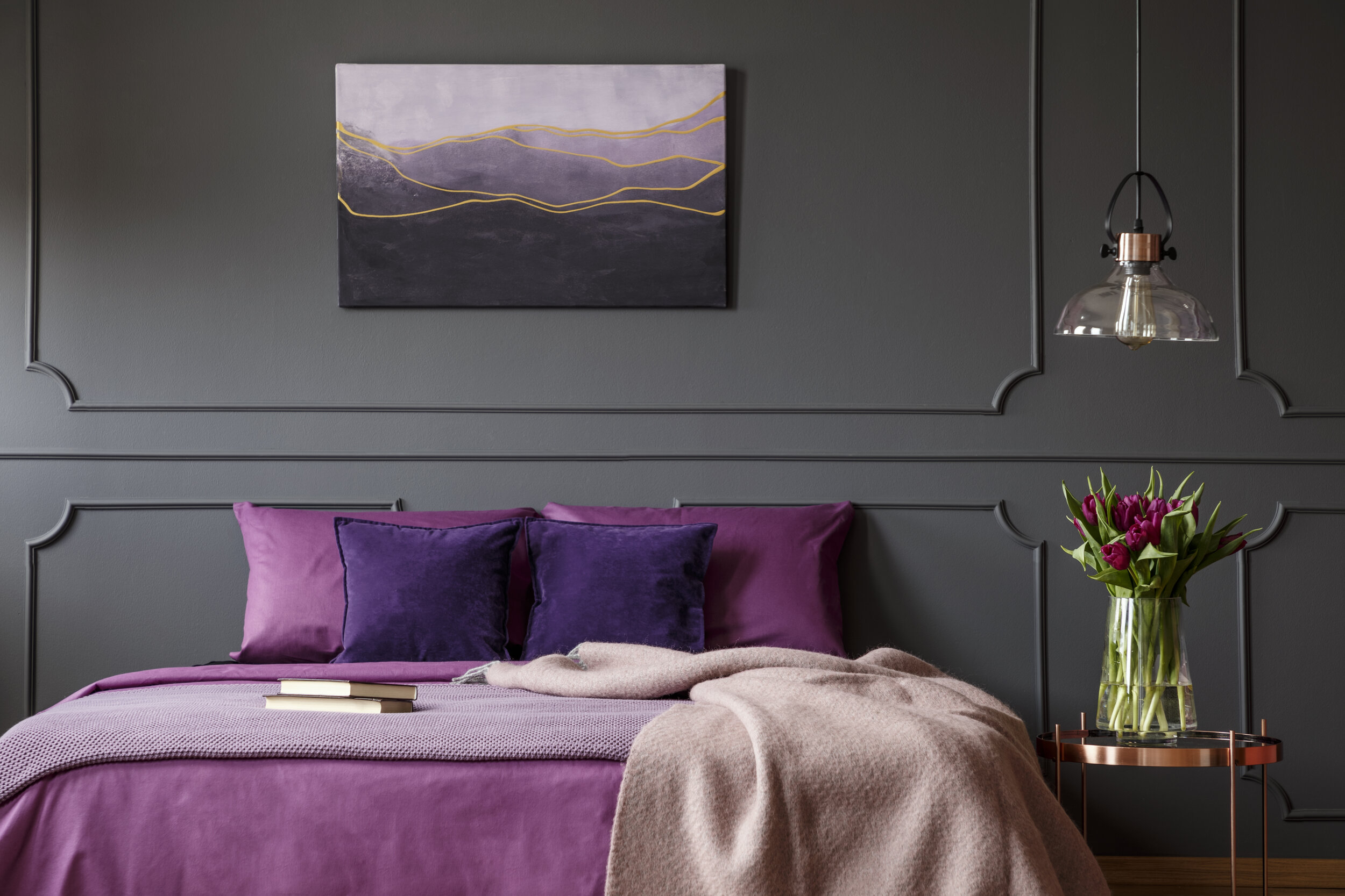
Dark, Cosy Monochromatic Colour Scheme
A dark, cosy colour scheme is perfect for creating a refined, mature and sophisticated bedroom. In the bedroom pictured, the colour purple has been used in varying shades, tints and tones to create a harmonious colour scheme, that oozes peaceful and serene vibes. By layering the colour purple from dark to light, particularly on the bed, this bedroom not only looks complete, but is also incredibly inviting…….just what you need after a hard day’s work!

Bright, Uplifting Monochromatic Colour Scheme
In contrast to the purple monochromatic bedroom above, this girl’s bedroom is bright and uplifting, whilst also maintaining an overall harmonious look. In this bedroom, the base colour used to create the monochromatic colour scheme is orange. Again, a layering of various shades, tints and tones has been used to create harmony and balance. It is worthwhile noting that orange, as a pure hue, has been intentionally avoided in this colour scheme, in order to maintain an overall feeling of calm within this room; a factor that is extremely essential for a young child’s bedroom.

Calm, Serene Monochromatic Colour Scheme
This living room is an exemplary example of a peaceful, calm and serene room in which to sit, relax and unwind. The perfect space to come home to from a stressful day at the office! At its core, is the colour red. However, to achieve the soothing vibes that this living room creates, pure red and close variants of it, have been excluded. Instead, the colour red has been softened down immensely to create varying shades, tints and tones of pink, in order to achieve the calming serene feel that this living room exudes. Also, great consideration has been given to the creation and execution of this monochromatic colour scheme, as even the colour of the planters is intentional!